SE 3
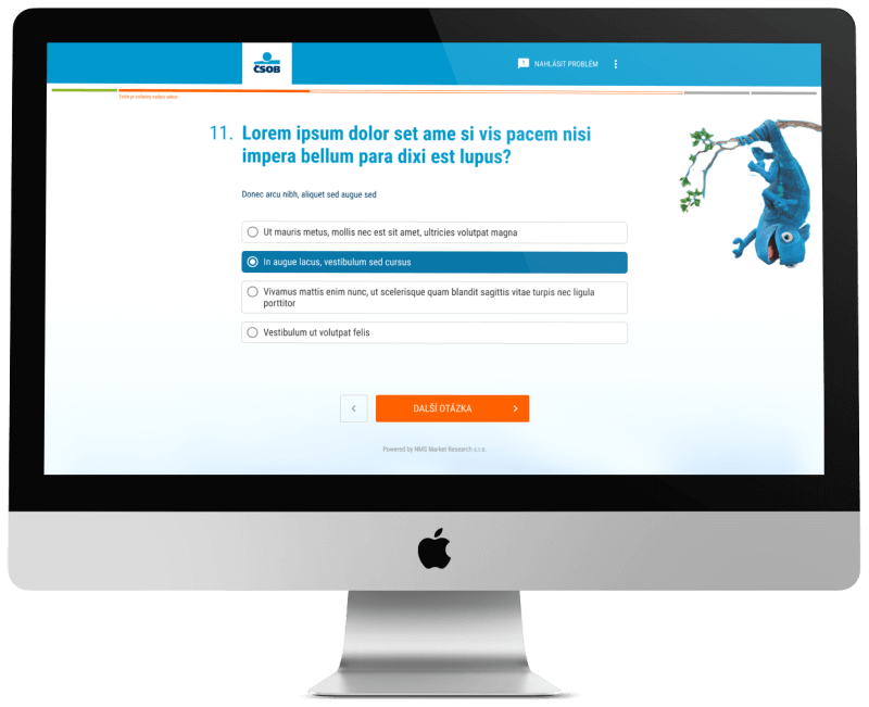
About the project
My role:
- User research and analysis
- Wireframes
- UI Design a prototypes
- Usability testing
- HTML/CSS coding
The design process
Research and analysis
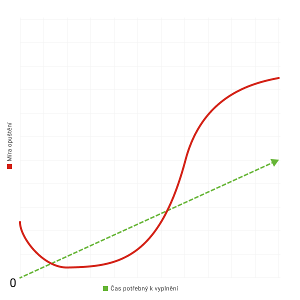
I divided the identified factors into several groups according to their impact on the completion of the questionnaire, the time spent on the question, the understanding of the question and the mistake rate in the answers. I identified the following as the factors with the greatest impact on the completion of the questionnaire:
- the device used to complete the questionnaire,
- the influence of the surrounding environment on the respondent,
- the number of questions,
- the complexity of the questions,
- the average time taken to complete the questionnaire.
We need attention
During testing, we also managed to identify the main motivators that are crucial for the respondent to complete the questionnaire. Those are:
- positive attitude towards the interviewer’s brand,
- financial reward,
- loyalty bonus.
Wireframes and prototypes
Findings:
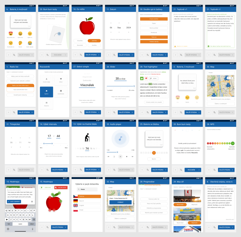
- respondents prefer a more visually attractive form of questions even at the cost of increasing their total number,
- respondents lack the possibility to save the uncompleted questionnaire and return to it later,
- respondents are very sensitive to the form of communication in relation to the interviewers‘ brand.
Solutions:
- enable users to interrupt the uncompletion of the questionnaire and return to it at a more appropriate time,
- break down complex question with multiple types of inputs into separate questions,
- create more visual alternatives to the questions to better match the interviewer’s communication style and the respondent’s perception of his brand.
Visualization
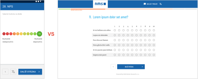
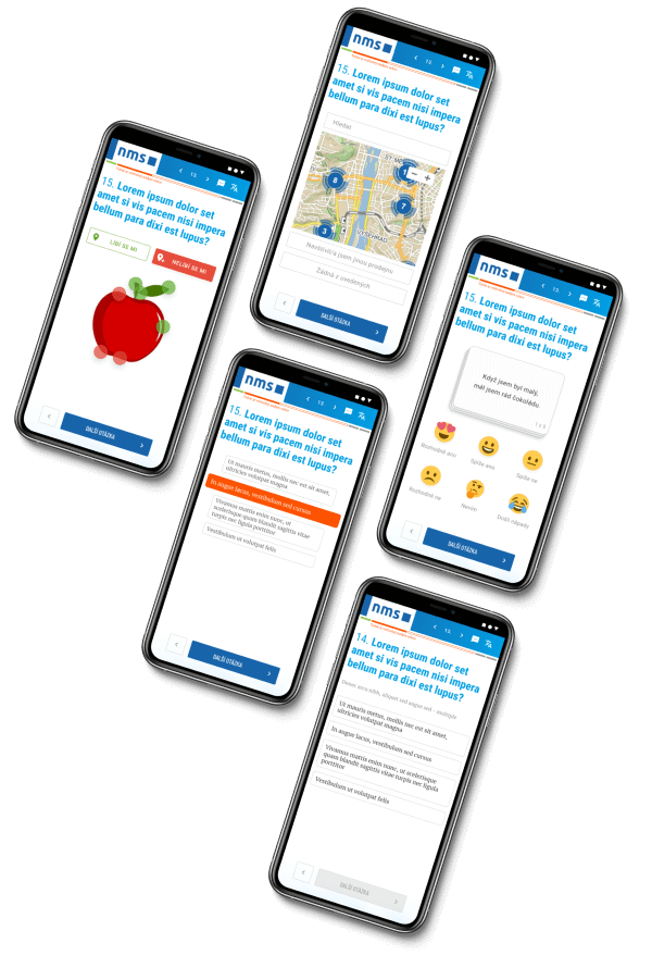
For the design of each question, I took into account the form of the respondent’s interaction with the questionnaire in relation to the device on which they work. While on mobile, a simpler and visually appealing form of questioning was preferred for all question types, on desktop some question types could be replaced with more complex variations while maintaining a positive impact on speed and friendliness of completion.
What I've learnd on this project?
More questions preferable, but not always: the respondent prefers simple questions for the survey, even at the cost of increasing the number of questions in the questionnaire and the time to complete it. Only on the desktop (where more display space is available) have I identified several types of questions where respondents prefer one longer question rather than breaking it up into multiple questions.
Respondent’s positive relationship with the interviewer’s brand: if the respondent has a positive relationship with the interviewer’s brand, which is visually presented in the questionnaire, this significantly increases the chances of completing the questionnaire in full, even if the respondent may not identify with the topic or some of the questions. The main motivation here is the desire to help and participate in something the respondent likes.
Go back
Contact
Contact me:
+420 606 927 868
hacek.93@gmail.com
