ASAP
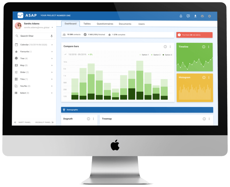
About the project
My role:
- User research and analysis
- User flow and automatization
- UI design
- Usability testing
- HTML/CSS coding
The design process
Research and analysis
For the design of the functions, graphs and user interface, I based the design on user requirements, methodological procedures and standardizations. The main user expectations were as follows:
- in the application you can create a tailor-made solution,
- the application can aggregate data from different sources in different structures and pass it on,
- the application will enable process automation.
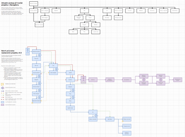
Process automation
- monitoring of selected identifiers and their values,
- data categorization,
- analysis of opportunities and threats.
Along with this, risk areas became apparent that could invalidate the presented results:
- poorly chosen visual presentation of data,
- their inappropriate combination and low informative value,
- overwhelming the user with non-priority information.
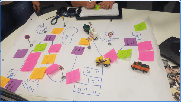
Wireframes and prototypes
Findings:
- users prefer chart formats they are familiar with,
- users want a graphical overview of qualitative data,
- users welcome automation options and intelligent filters.
Solutions:
- where possible, basic chart formats were used,
- I expanded the range of graphs to include types suitable for presentating qualitative data,
- I set up a concept of post-production for data for processing.
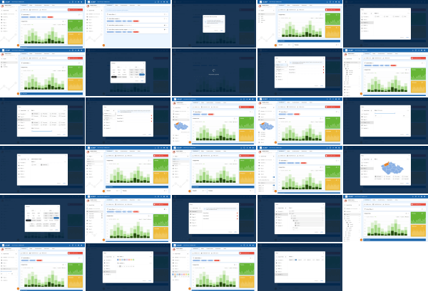
Visualization
- I standardized the basic properties of all components and modules,
- I changed the concept of data visualization to compare the dependencies between qualitative and quantitative data.
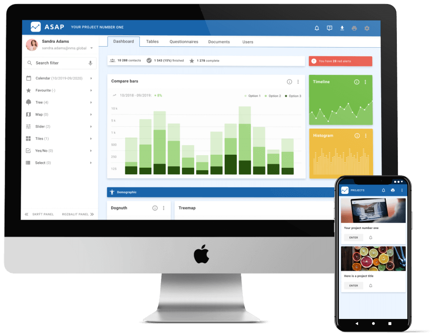
Thanks to additional testing, I obtained enough data to be able to describe the influence of individual components on working with the application as a whole. This allowed me to unify the form of user interaction across modules and components.
What I've learnd on this project?
From stereotype to automation: due to the diversity of aggregated data and their further processing, I didn’t expect to be able to unify the procedures for their analysis. Thanks to further testing and analysis of real user interactions over real data, I was able to characterize scenarios and events that can be automated and save users time.
The familiar is simpler: users need to receive information in a format they understand. Thanks to the set concept of data visualisation, the application can display data in the form the user needs it. All this without changing user interactions and forcing a different way of working in the user interface.
Go back
Contact
Contact me:
+420 606 927 868
hacek.93@gmail.com
