Oyster Club
About the project
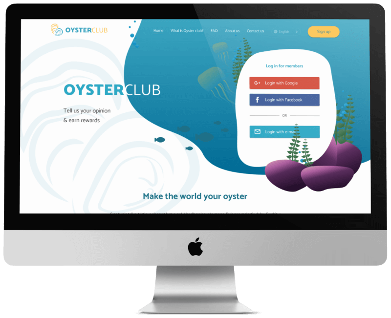
Oyster Club is an online panel of people for research and testing.
My role:
- User research and analysis
- MVP definition
- Wireframes and prototypes
- UI Design
- Usability testing
The design process
Research and analysis
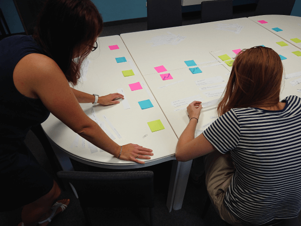
Based on the results, I defined the personas I referred to during the product development process. Each persona had a scenario that matched the realistic goal of user interaction with the application. For each persona, I focused on specific goals, frustrations, and motivations to interact that influenced the reason and way the application was used.
MVP definition
- credibility of the app collecting personal data,
- immediate help in case of a problem with profile creation,
- rapid involvement of new respondents in research,
- verification and recommendations of relevant respondents.
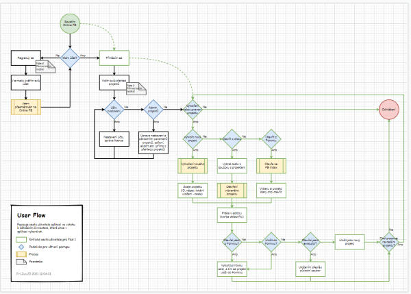
Thanks to this information, I was able to define the MVP and the critical path of the user.
Wireframes and prototypes
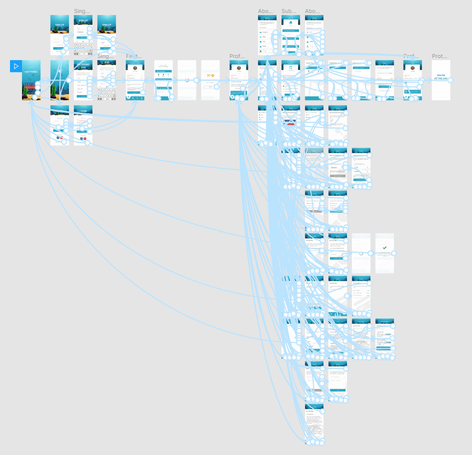
I prepared a prototype for each iteration and added the elements and screens that were necessary to achieve the users‘ goals to see which worked best. I prepared everything in Figma, where I created an interactive LF, then HF, prototypes and tested user stories on several individuals.
Findings from the first round of HF testing:
- users want to be able to filter project offers according to their own interest,
- users welcomeda screen with the details of the project to which they are invited,
- users will appreciate the opportunity to try out the app before taking the time to fill out a profile.
Solutions:
- a filter has been added to the list of projects,
- in the profile, users can set their areas of interest – the corresponding research invitations will then be displayed to them as a priority,
- we’ve created test and sample content where the user can test the app and its features.
Visualization
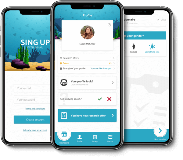
Thanks to initial research and testing, we have been able to address the issue of ocean protection that resonates with community in Southeast Asia. We therefore decided to combine the visual of the application with the marine theme and at the same time we used the theme to support the credibility of the newly emerging brand.
What I've learnd on this project?
Symbolism in design system: I couldn’t design a product for users whose culture I know nothing about. We needed a product that will be close to the people and will find support across the entire population. Symbolism and community responsibility are the main elements on which I built the visual.
Credibility above all: a completely different life style and perception of the world around us have challenged us. Other values and societal preferences also affect the view of the data that users are willing to provide and what level of reassurance they need beforehand. Gaining their trust and turning potential users into real ones was reflected not only in marketing, but also in the visual concept of the application.
Go back
Contact
Contact me:
+420 606 927 868
hacek.93@gmail.com
