Snack snap

About the project
Snack snap is a mobile app for collecting data on consumer behavior. In the app, the consumer records food purchases together with additional information. The contracting authority will be a database of qualitative and quantitative information, which it uses to market its products and brands.
My role:
- User research
- Wireframes a prototypes
- UI Design
- Usability testing
The design process
The development of the application required a change in the approach to development and subsequent launch. A tight deadline and a low budget were crucial to the approach I took. The client and I agreed that perfect was a barrier to finished. We agreed to launch a pilot version of the app as quickly as possible. And only on the live app will we collect and evaluate further data.
Research and analysis
Initially the most neglected part. I did only a basic research and compared the information obtained with the client’s expectations. I prepared several personas and scenarios that helped me design a simple enough interface to get all the data I needed.

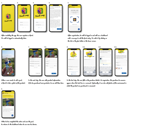
Storyboard
One of the steps I went through in the design process was storyboard. For different scenarios, I prepared a sequence of screens that simulated the consumer’s passage through the app. Based on the designed storyboards, I prepared prototypes that I tested.
The storyboards allowed me to better lay out the elements in the app to make it as user-friendly as possible in a given scenario. According to the results obtained by validating them, I designed the final form of the app.

Prototypes
I prepared prototypes according to the designed storyboards to test user behavior and the effect of the layout of user interaction elements on the quality and quantity of the collected data.
Findings:
- users want to be able to fix a product they have already entered,
- 2 minutes – if the user had to create a record longer, the quality of the data obtained began to drop significantly,
- respondents do not want to waste time filling in information that is the same for all products,
- they want to be able to add 1 or more products in one record.
Solutions:
- I added an itinerary of the products entered in the record,
- I split the form into multiple independent screens,
- I modified the interface to make entering 1 product as fast as possible, but at the same time it’s easy and quick to add another product to the record.

Next steps
The results from testing the prepared prototypes were crucial for the visualization. The final design is a summary of all the ideas and comments I recorded during testing.
The main criterion for the design was speed. The consumer must have the product entered in seconds and the complete form filled out within two minutes. The key was simplicity and clarity for quick user orientation.
The application was launched in test mode for the internal employees of the contracting authority. Further development of the application will be determined by the data obtained from the pilot operation.

Are you interested in further details and with what results did we launch the project? Contact me, I'll be happy to tell you more 🙂
Go back
Contact
Are you interested in working with me or do you want to ask something?
Contact me:
+420 606 927 868
hacek.93@gmail.com
